It is with gleeful excitement that I refine another step on my writing and publication journey today: branding.
Brand (n.) a name, term, design, symbol, or any other feature that identifies one seller’s good or service as distinct from those of other sellers.
Authors need brands just as any other good or service, and arguably we even provide both goods (the book) and service (entertainment), so that probably means we need an extra-special double-whammy super-good brand. The black and white jobby above… well, it does a job, but… a very black and white one. Not Good Enough!
You may have noticed that I have recently introduced a slogan, or motto:
![]()
I use it on this blog, on Twitter, Facebook and everywhere else I feature as an instant way to associate myself and my writing with the idea that my books are glamorous, fun, exciting and contain an element of contemporary fairytale. That’s a lot to take in, but it works!
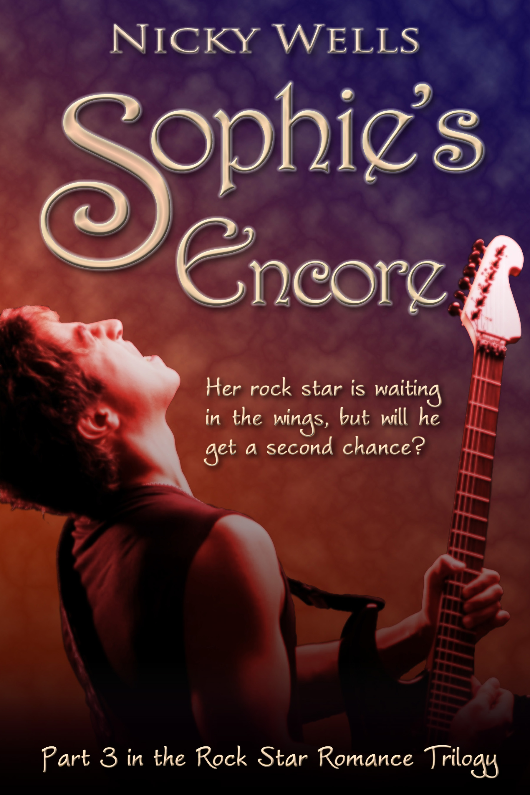
However, the slogan needs a strong visual element to complement it; and it is after much searching and many a design effort, and with the help of some fantastic friends, that I am finally able to realise my vision for a logo and introduce it right here, right now:

And so a huge big thank you goes out to everyone who was instrumental in helping me create the Romance That Rocks Your World! logo:
 THE HUSH! Thank you so much for sharing an image featuring this amazing lighting rig and lights for me to use in my logo! (For those of you who missed it, THE HUSH featured in Nicky Reviews Rock not too long ago… go meet them there!)
Sue Bowen! Thank you for taking this photo and letting me use it ‘as I please’–your fantastic shot made all the difference!
Amy and Katie at Sapphire Star Publishing! Thank you for considering many an iteration of this logo, from its first purple incarnation over an impenetrable purple haze effect right down to this last version.
And here’s a little anecdote regarding creativity and inspiration…
So I had a vision for this logo right from the moment I came up with the slogan and the idea for the brand. I spent weeks trawling my own photo archives and the Internet for a suitable photo, but finally struck gold when I reached out to the amazing HUSH BAND and pleaded for an image.
Image safely received, I spent hours and hours playing around with it, cursing my ineptitude as a designer and the lack of proper formatting and graphics software. I tried shades of purple (too purple) and gold (too tacky). I layered picture over a picture to gain a sort of ‘dry ice effect.’ I cut and pasted and copied and twisted and distorted. I emailed several versions to Amy and Katie. I ran out of ideas.
Then, on a rainy Bank Holiday Monday morning when the family and I were on a trip up to see the children’s grandparents, I was sitting in the car turning ideas over in my head and I suddenly realised where I’d gone wrong all this time. Luckily I had the laptop with me and proceeded to fire it up, much to my husband’s surprise. Within half an hour, I had started all over again and with the miles whizzing by and the rain lashing the window, inspiration took shape and the logo emerged. I actually made three variants on the theme but I knew I’d cracked it. It was the most amazing feeling, especially as I’d felt so frustrated and despondent when we set off.
And the moral is? The mind works in mysterious ways; you never know when inspiration is going to grab you; and follow your heart where it takes you (and when!).
Have you ever found a miraculous solution to a thorny problem in the most unexpected circumstance? I’d love to hear about it! (And obvioulsy, feel free to say loads of nice things about this logo……….)
🙂
Rock On!